
S U R F A S O T A
The new surfing brand of Sarasota
While building this brand, I had the wonderful pleasure of working along side Rhiana Acuna De Leon. Together we developed concepts, logos, style boards and much more!

The beginning
It all starts with research. Within this brand, we wanted to show its rich history while also making sure it doesn’t look brand new and appeals to the water centric community.
What is this rich history you ask? Great question! A very long time ago, the Sarasota Uzita Indian Tribe actually founded the Sarasota / Lido Key area. It is said that the story of Pocahontas is actually based off of a similar scenario that happened within the Uzita Tribe.
This history ties into the myth behind our brand. Sarasota isn’t exactly known for its huge surfing waves, so we created a myth as to where the huge waves have gone! The myth is that when the Sarasota Uzita Indian tribe founded Lido Key, the waves were massive and destructive. Out of fear, they made an agreement with mother nature to bless the land and ocean. But, in return there must be one day out of the year where the waves go back to being vast and gnarly. Thus surfers from all around will come to Sarasota in hopes to find these huge waves that are rumored to come once a year.
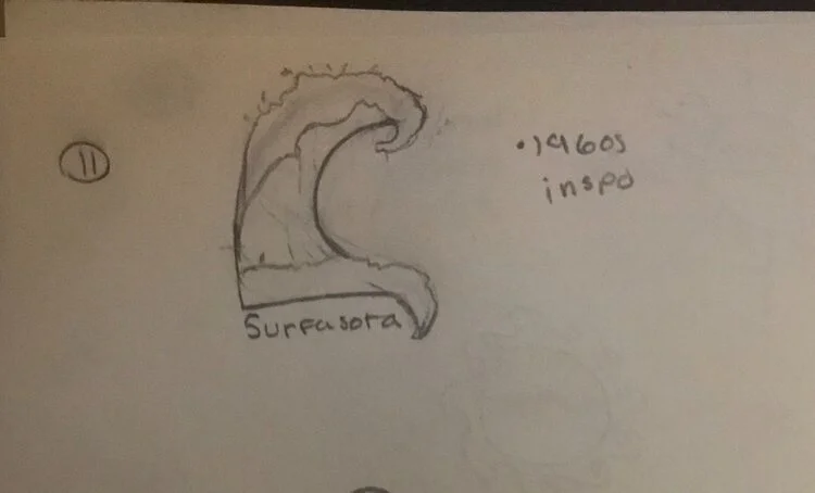
Next you gotta put pen to paper!
Keeping the research and goal in mind, I used this to develop sketches. Some things I looked into included surf designs from the 50’s-90’s and tribe symbolism. I used these things as a jumping off point because we wanted to make sure this brand didn’t look brand new while also containing hints to its history.
Sketches


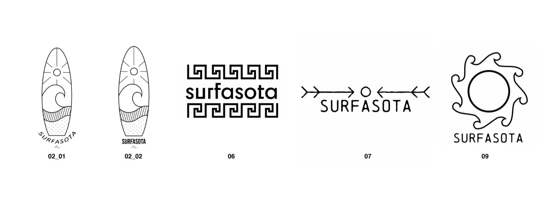
Vector logos
The sketches were then turned into vector logos.
Out of these logos, numbers 2, 6, 7, and 9 were chosen to move forward with and further revise

Vector logo revisions
Logos 2, 6, 7, and 9 continued to be developed.


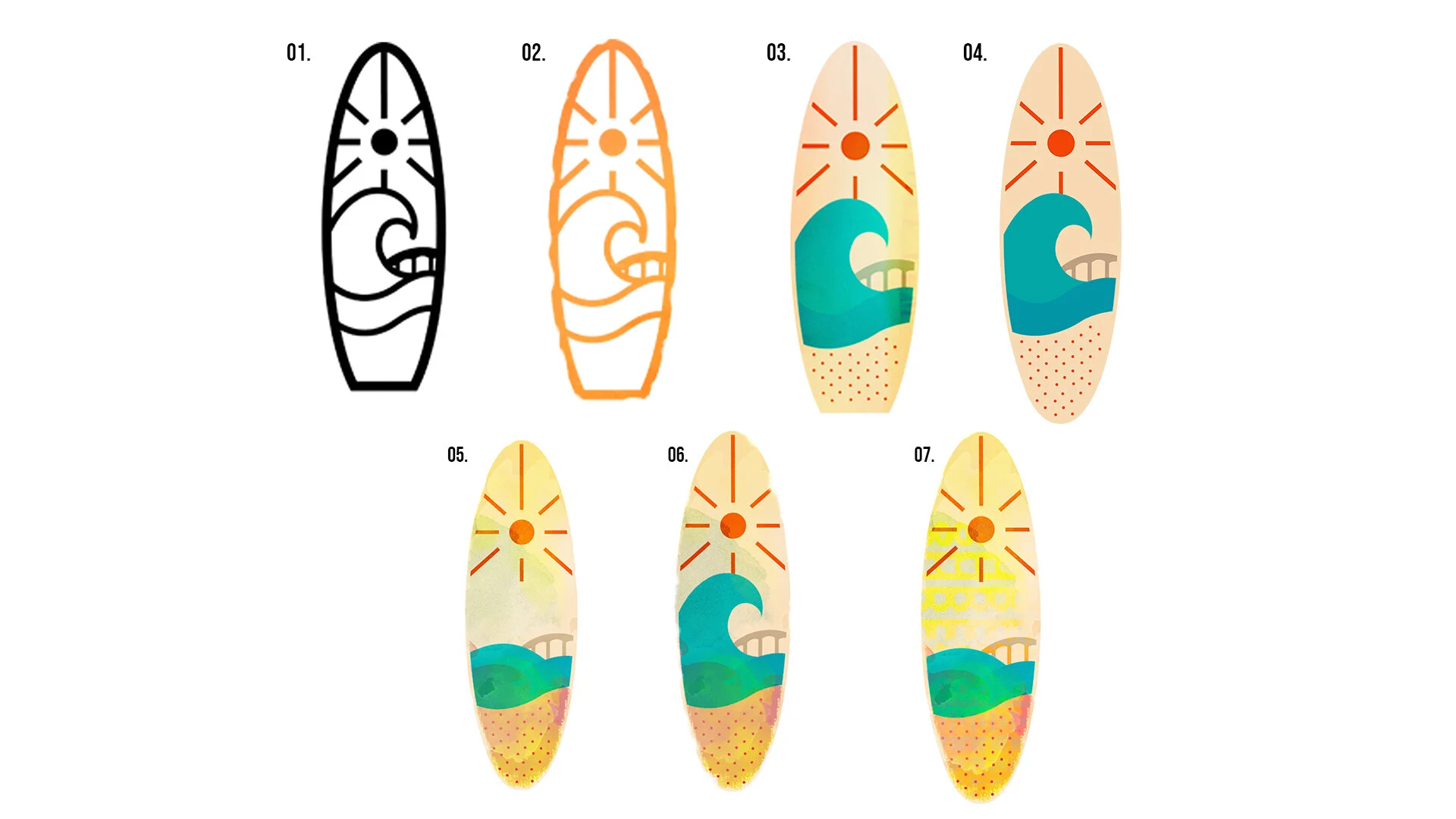
Styleboards
Showcasing what these logos would look like in different styles and color palettes.


The chosen two
Out of logos 2, 6, 7, and 9, numbers 2 and six were chosen to continue moving forward with.
More revisions!
These logos still weren’t quiet there yet… They needed to feel fun, free, and wild, much like surfing! This meant lots of iterations. To achieve this feel of freedom, we really explored the type and its placement. Before it was very linear, but it then developed into subtle shifts and imperfections that felt more free.


Almost there!!
After looking at the iterations, one was chosen. The logo previously known as number 6 became the winner. Specifically iteration number 7. However, more development was now needed! Now that we had a winner, we made many iterations with different placements of each letter. We did this to find the best solution for readability and breathability. We also explored using the ‘O’ as a sun, but agreed it felt too off balanced.


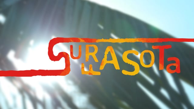
Final Logo
After all of those iterations we finally came to an agreement on what our logo should be! The logo chosen was logo iteration #6.
So you might be thinking, what the heck does this logo even mean?
The word Surfasota itself is the combination of ‘Sarasota’ and ‘Surf’. We thought this would be a great way draw people to Sarasota’s beaches.
The logo design takes inspiration from multiple things. The ‘S’ derives from the shape of the Native American symbol for running water. We went with this symbol because I found it to also be a fun play on words, because when you’re surfing, its like you’re running on water.
The shape developed to contain more of an organic feel. We felt staying rigid didn’t feel free and relaxed. From there, it took hints from the curl of a wave as well as the fins on a surfboard.

Its meaning


Now the really fun part :)
Time to see what this logo will look like on products!


See something you like?
