
DISCOVERY INTROS
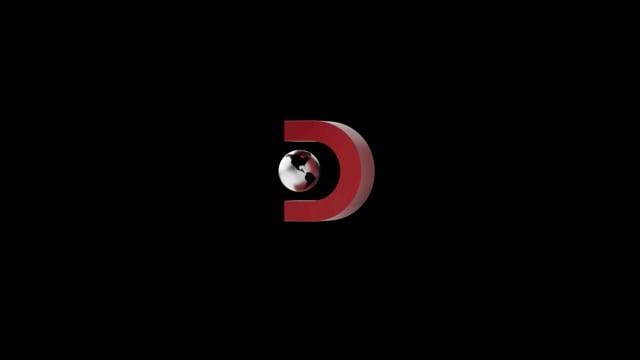
Discovery Channel Presents logo animation.
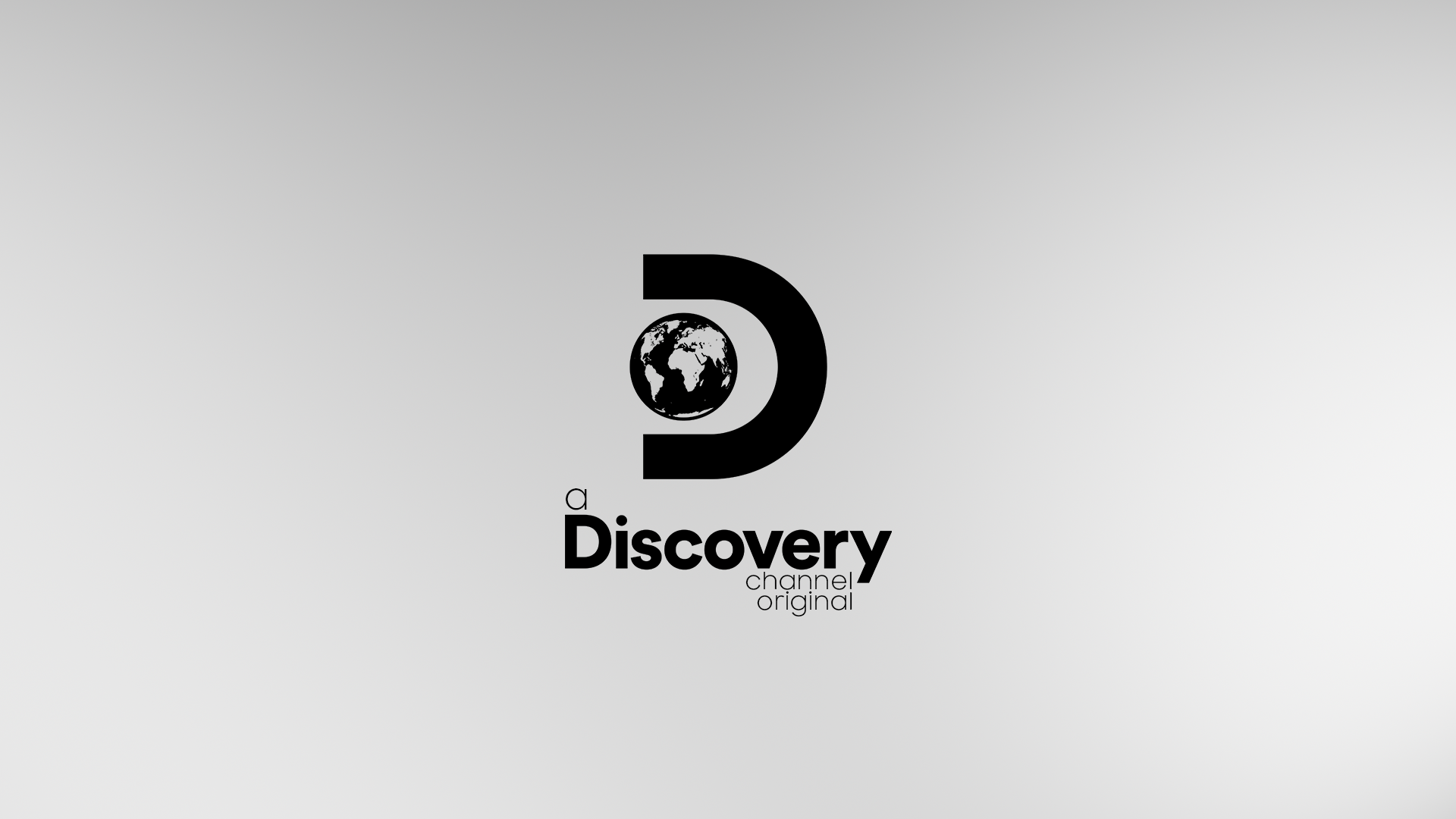
Discovery Channel Originals logo animation.
The design challenge
The design challenge I was tasked with was to create branded intros for Discovery Channel. One of the intros would be for ‘Discovery presents’ and the other for ‘Discovery originals’. Each would contain two different looks and design approaches since ‘presents’ and ‘originals’ are showing different things. Presents are when something is being shown on the network and originals are something that has been funded by the network.
About Discovery Channel
The Discovery Channel shows a variety of shows that revolve around exploration, education, curiosity, and the quest for knowledge. These shows range from exploring space and time to living in Alaska, and how moonshine is made.
The current brand strategies use live footage and videos. For their current idents, it uses footage that pertains to the show being viewed, then followed by their logo animation.
Audience — young teens and up, 16+. Outdoor lovers, thrill-seekers, and curiosity chasers.


Initial design pitch
Direction one: Collage
Direction one, collage, encompasses what Discovery Channel represents through the use of live imagery in collage form. Some of this imagery includes different sceneries from the ocean to the forest.


Direction two
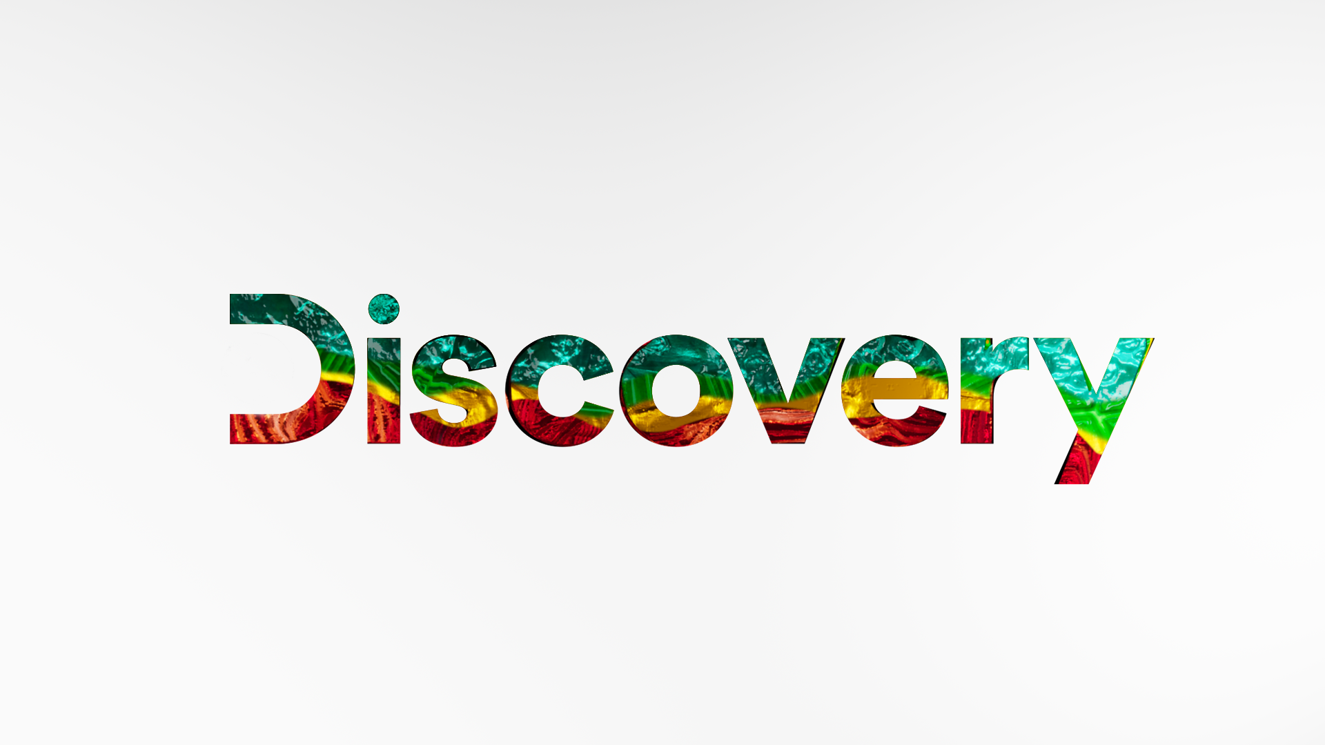
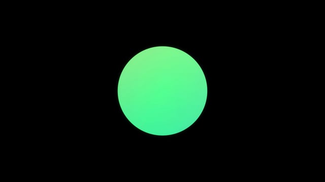
Direction two: Curiosity
Curiosity drives so many of the shows on Discovery Channel. What if this curiosity was shown through abstract textures that hint at the shows while also leaving the viewer curious and wanting more.


First pass animation
Direction two
Direction two, Curiosity, was chosen to move forward with for Discovery Originals. From there, I further explored Discovery Presents.
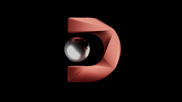
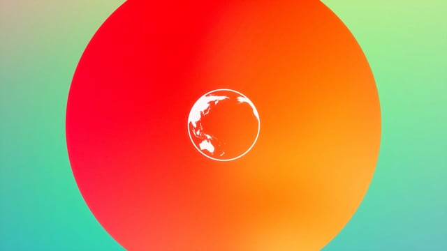
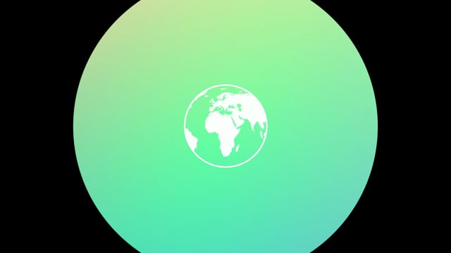
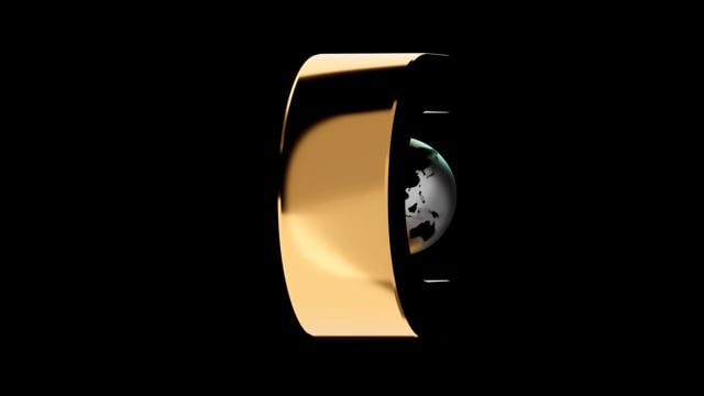
For Discovery Presents, I explored using a similar shape language to Discovery Channels earth and using abstracted shapes of the Discovery logo.
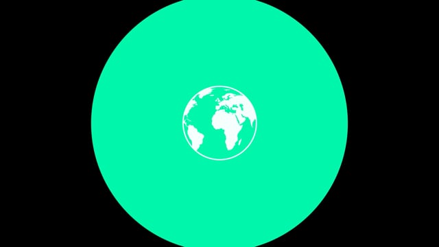
This version was decided to move forward with because it hinted at the Discovery logo and what it represents through different colors.
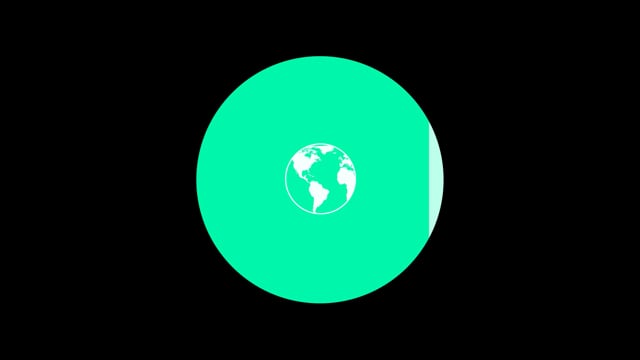
For this version, I explored abstracting the shape language of the Discovery logo text to reveal through the circular shape language. However, moving forward it was decided this was too distracting and would create too many tangents.
Second pass
In this pass, I explored the use of gradients to show case the variety Discovery Channel shows. The use of gradients also felt for modern instead of using flat colors.
Third pass
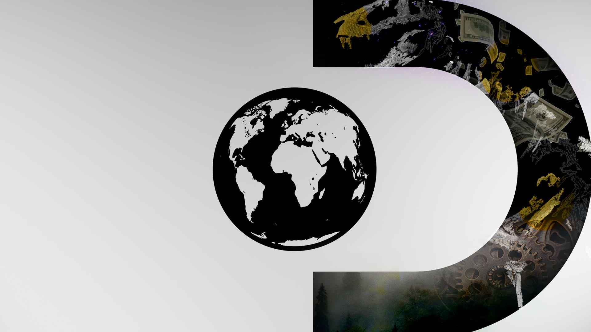
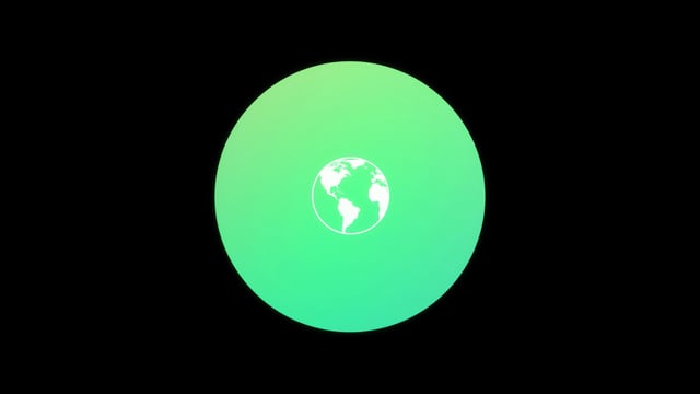
From there, for Discovery Original's I explored showing more dimensionality of the logo. This would help highlight the different textures and implement more curiosity from viewers.
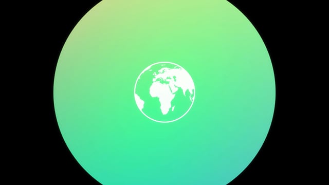
For presents, I made the colors richer and added subtle changes with a glow to add more depth to the animation.
The sound was then added as it helps the viewers identify the brand with a sound.
Getting down to the nitty gritty, this pass has ‘presents’ animate on at the same time as the Discovery logo.
This pass has ‘presents’ animate on separately. My art director decided this felt better as it gave ‘presents’ its own special movement.
Final pass
Now little tweaks and getting the fluid motion down!
Discovery Channel Presents
Discovery Channel Originals