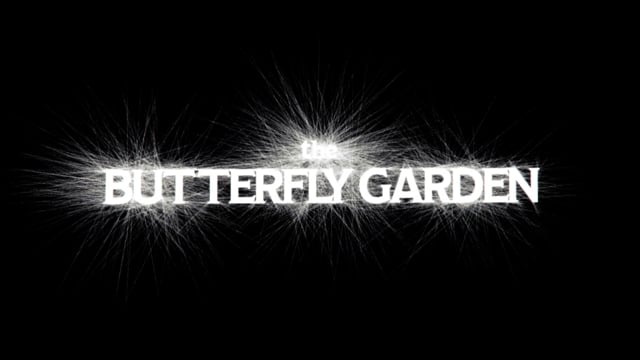
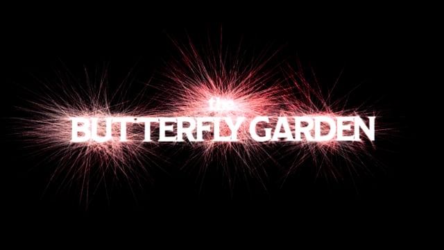
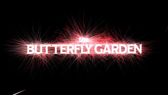
THE BUTTERFLY GARDEN
*WIP for a full tittle sequence
The design challenge
The design challenge I was tasked with was to create a logo title lock up for a selected book that will bring it to the attention of viewers. This animation will be used for trailers in the theater, online, and on TV.
About the book
The Butterfly Garden by Dot Hutchison tells the story of an isolated mansion where a beautiful garden lies. In this garden grow luscious flowers, shady trees… and a collection of precious “butterflies” — young women who have been kidnapped and intricately tattooed to resemble their namesakes. Overseeing it all is the Gardener. When the garden is discovered, a survivor slowly sheds light on life in the Butterfly Garden and horrific tales of a man who’d go to any length to hold beauty captive.
Fiction
Audience — Intended for mature audiences, 17+, young adult.
Warning: Spoilers below!

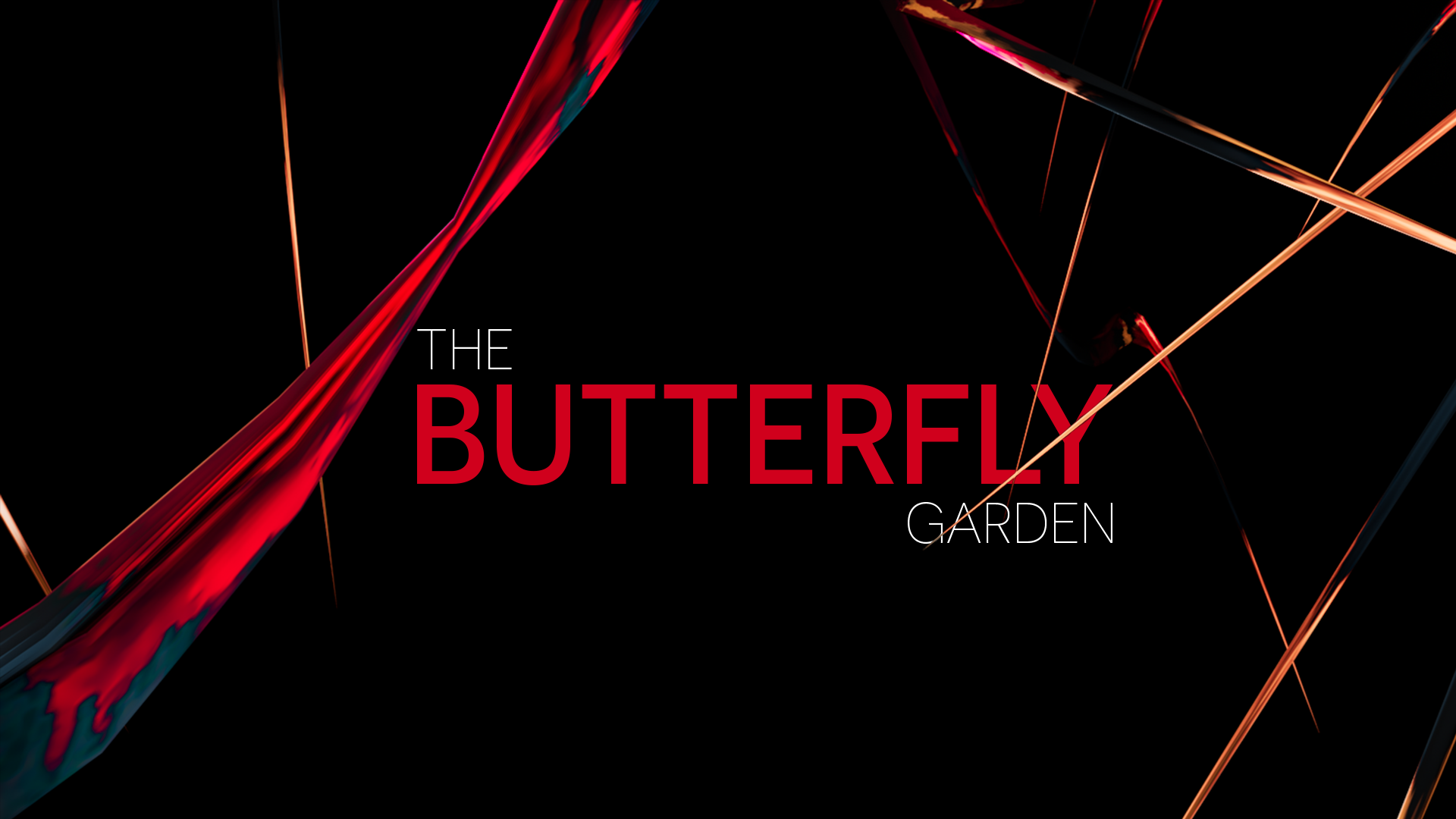
Distorted
One day living life normally, the next having their world turned completely upside down, forced to accept this distortion as reality. This idea of distortion is shown through the distortion of flowers, which are ever present in the garden.


Reveal
This book reveals all the details of what occurred in the garden in bits and pieces, eventually forming the whole. Through the use of cloth, it will reveal pieces of the title, eventually forming the whole. Cloth is used because dress is important in the garden. The girls are provided with solely black clothing up until their time in the garden has expired. They are then given an elegant gown full of colors to represent the specific butterfly tattooed on their back, and this is the dress they will die in.
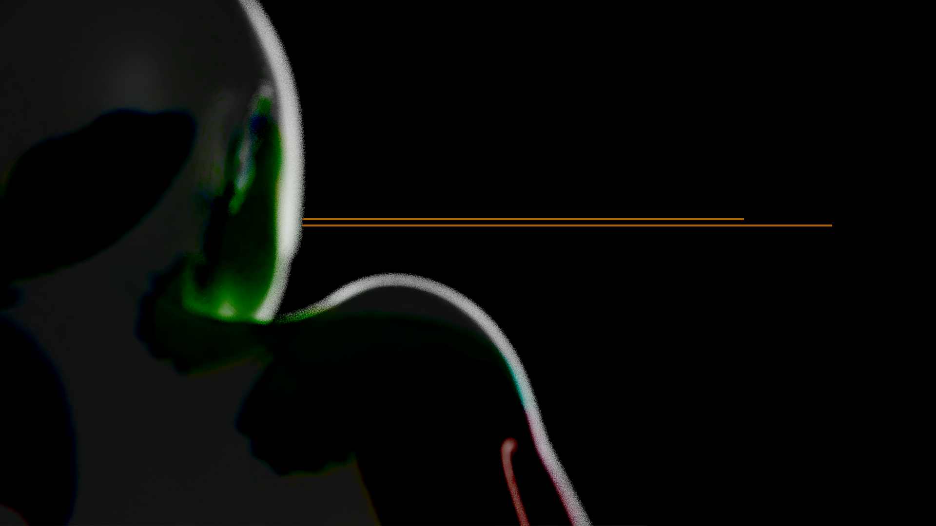
The tattoo
Tattoos were given to each girl, and each resented it. These tattoos might be on their bodies but its not who they are. This would be shown by using a light to project butterflies onto the body, when the body moves the butterflies will not remain attached.


Yes but also no
Out of these concepts, distortion was chosen to move forward with. However, it still wasn’t there yet!
The title needed to be the main focus a treated as a unit, not paired with a visual. It needed to become the visual! From here I continued to explore this idea of distortion along with the title.


Direction two
Exploration two was chosen to move forward with. I then began to explore how this would animate onto screen and where it would appear in the film.
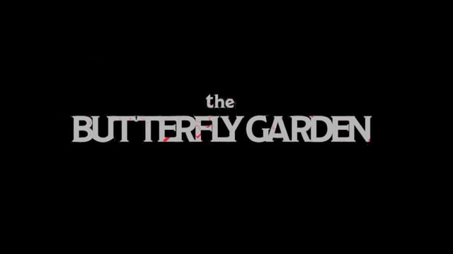
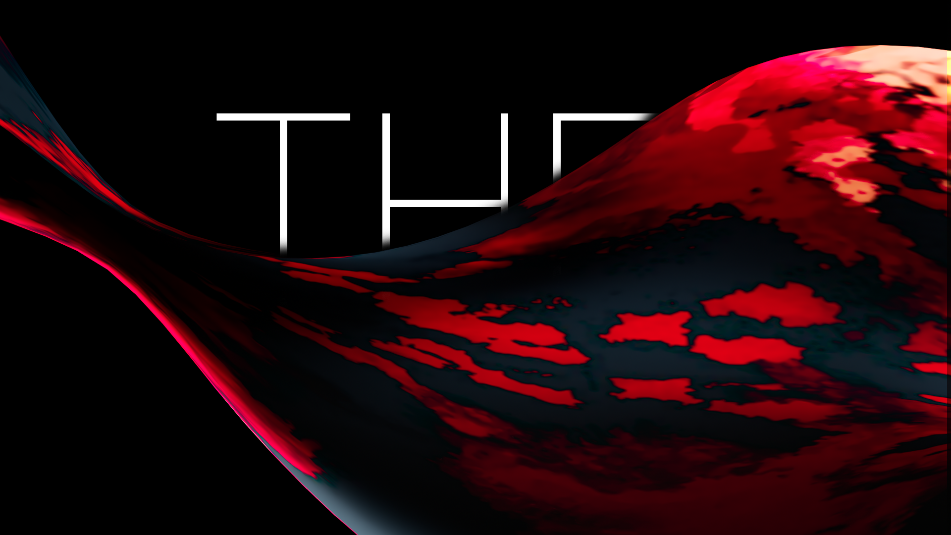
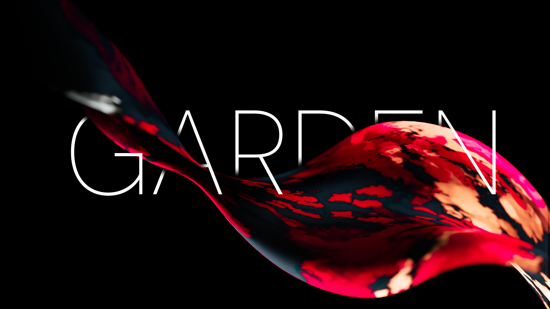
Second pass animation
In these two passes, the use of color was explored as well as close ups and different shots of the title growing onto screen.
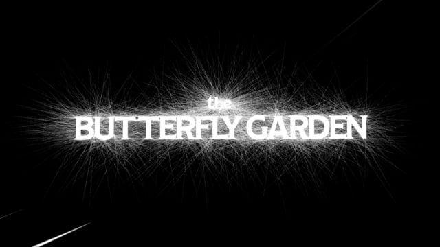
Final animation
From there, the shots leading up to the whole logo were refined. It was then also placed into theater view ( 2046 x 858).